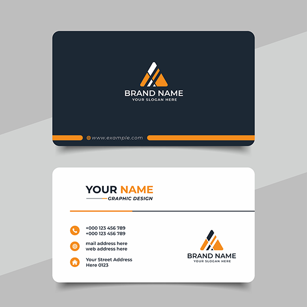
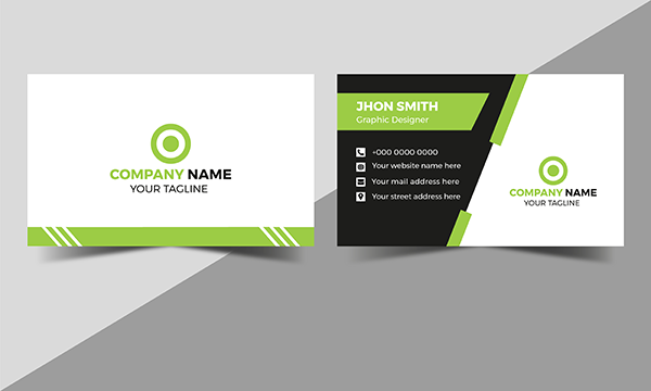
What is a simple business card and why is it important? Have you ever been handed a business card that has three or four contact phone numbers? Unless you are an emergency medical doctor you are not important enough to require large number of contact phone numbers. I once was handed a business card that had three office phone numbers, two cell numbers and two fax numbers. The guy was an insurance salesman. It was total overkill and quite confusing. He thought it made him look more important. It didn’t. It made him look arrogant and possessing an attitude of superior importance. Is that the image you want to project to the recipients of your business cards? Me either. Simple business cards are what the overwhelming majority of business folks need.

Simple Business Cards Need The Following;
- Name of your business (optional logo may be included)
- Your Name
- Business Phone Number
- Cell Phone Number
- Email address
- Business Address
Easily identified contact information on a simple business card will guarantee you more contacts than a card that is difficult to read and therefore unnecessarily complicated. It should be easy to contact you. Difficult contact information is a bad and common business practice for some folks who have a hyper sense of importance or want to appear to be bigger than they actually are.
Using both sides of a business card is fine. On the back side of your simple business cards, you can show products and services offered and other information that you deem truly relevant and important. Get a second opinion on what you deem truly relevant and important. You can thank them later.
Don’t make the font size too small where it is difficult to read the information provided. That is really annoying, and it will cost you actual contacts for sure. Make it as easy as possible for someone to contact you that has genuine interest in you, your services, or your products. Why be your own worst enemy when it comes to customer or client contacts?
Simple business cards will pay off versus complicated business cards. You can and will take that to the bank. Keep your color selection tasteful as well. Wild and bright unnecessary color combinations are showy but have little positive impact on how you are received when someone looks at your business cards. Exotic fonts are also a no-no. KISS (Keep it simple stupid). Hope this helps. Select Marketing can help you with all phases of acquiring simple business cards for you and your staff. Contact Select Marketing at your earliest convenience.


Leave a Reply